Dropdown
A dropdown control that allows users to select a single option from a list of options.
Example:
ft.Dropdown(
    width=220,
    value="alice",
    options=[
        ft.DropdownOption(key="alice", text="Alice"),
        ft.DropdownOption(key="bob", text="Bob"),
    ],
)

Inherits: LayoutControl
Properties
autofocus- Whether the control will be selected as the initial focus.bgcolor- The background color of the dropdown menu in variousControlStatestates.border- The border drawn around the decorated input area.border_colordeprecated - The border color.border_radiusdeprecated - Rounds the corners of an outlined border.border_widthdeprecated - The width of the border in virtual pixels.capitalization- Configures how the text input should be capitalized.color- Text color.content_padding- The padding for the input decoration's container.dense- Whether the TextField is part of a dense form (i.e., uses less vertical space).editable- Whether the dropdown allows editing of the text input field.elevation- The dropdown's menu elevation in variousControlStatestates.enable_filter- Determine if the menu list can be filtered by the text input.enable_search- Determine if the first item that matches the text input can be highlighted.error_style- TheTextStyleto use forerror_text.error_text- Text that appears below the input border.expanded_insets- The insets for the expanded dropdown menu.fill_color- Background color of the dropdown input text field.filled- Whether the decoration's container is filled with themefill_color.focused_border_colordeprecated - Border color in focused state.focused_border_widthdeprecated - Border width in focused state.helper_style- TheTextStyleto use forhelper_text.helper_text- Text that provides context about the input's value, such as how the value will be used.hint_style- TheTextStyleto use forhint_text.hint_text- Text that suggests what sort of input the field accepts.hover_color- The color of the dropdown input text field when hovered.input_filter- A filter to apply to the text input field.label- Optional text that describes the input field.label_style- Thelabel's text style.leading_icon- An optional Icon at the front of the text input field inside the decoration box.menu_height- The height of the dropdown menu.menu_style- The menu style that defines the visual attributes of the menu.menu_width- The width of the dropdown menu.options- A list of options to display in the dropdown.selected_suffix- A control to display after the selected item in the dropdown.selected_trailing_icon- An optional icon at the end of the text field to indicate that the text field is pressed.text- The text entered in the text field.text_align- The text align for the TextField of the Dropdown.text_size- Text size in virtual pixels.text_style- TheTextStyleto use for text in input text field.trailing_icon- An icon to display at the end of the text field.value- TheDropdownOption.keyof the dropdownoptionscorresponding to the selected option.
Events
on_blur- Called when the control has lost focus.on_focus- Called when the control has received focus.on_select- Called when the selected item of this dropdown has changed.on_text_change- Called when thetextinput of this dropdown has changed.
Methods
focus- Requests focus for this control.
Examples
Color selection with filtering
import flet as ft


def main(page: ft.Page):
    page.theme_mode = ft.ThemeMode.LIGHT

    def get_options() -> list[ft.DropdownOption]:
        colors = [
            ft.Colors.RED,
            ft.Colors.BLUE,
            ft.Colors.YELLOW,
            ft.Colors.PURPLE,
            ft.Colors.LIME,
        ]
        return [
            ft.DropdownOption(
                key=color.value,
                content=ft.Text(value=color.value, color=color),
            )
            for color in colors
        ]

    def handle_dropdown_select(e: ft.Event[ft.Dropdown]):
        e.control.color = e.control.value

    page.add(
        ft.SafeArea(
            content=ft.Dropdown(
                key="color_dropdown",
                editable=True,
                label="Color",
                options=get_options(),
                on_select=handle_dropdown_select,
            ),
        )
    )


if __name__ == "__main__":
    ft.run(main)
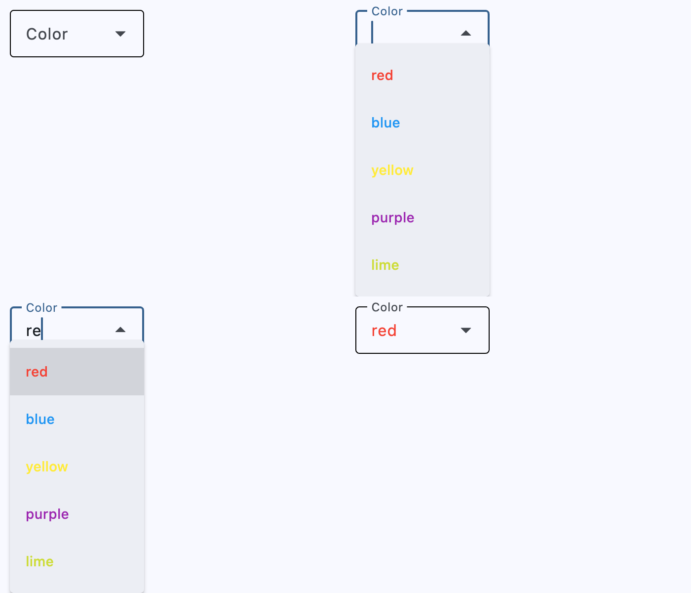
Icon selection
import flet as ft


def main(page: ft.Page):
    def get_options() -> list[ft.DropdownOption]:
        icons = [
            {"name": "Smile", "icon": ft.Icons.SENTIMENT_SATISFIED_OUTLINED},
            {"name": "Cloud", "icon": ft.Icons.CLOUD_OUTLINED},
            {"name": "Brush", "icon": ft.Icons.BRUSH_OUTLINED},
            {"name": "Heart", "icon": ft.Icons.FAVORITE},
        ]
        return [
            ft.DropdownOption(key=icon["name"], leading_icon=icon["icon"])
            for icon in icons
        ]

    page.add(
        ft.SafeArea(
            content=ft.Dropdown(
                key="icon_dropdown",
                border=ft.UnderlineInputBorder(),
                enable_filter=True,
                editable=True,
                leading_icon=ft.Icons.SEARCH,
                label="Icon",
                options=get_options(),
            ),
        )
    )


if __name__ == "__main__":
    ft.run(main)
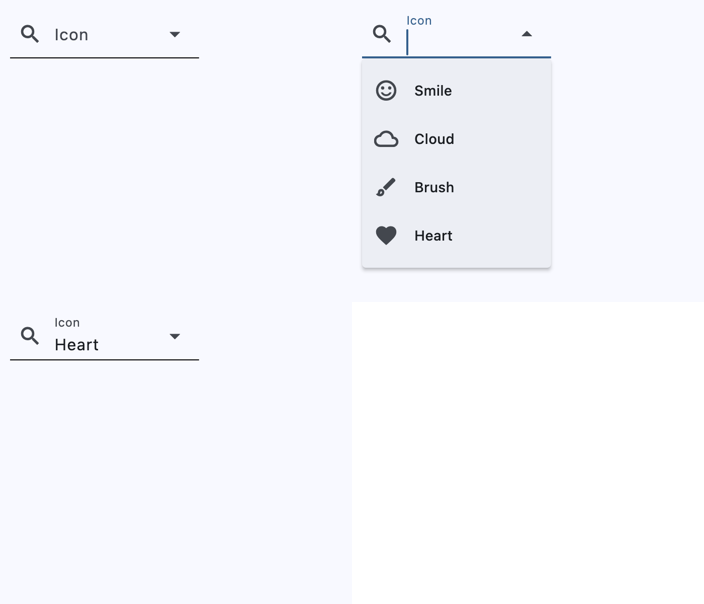
Declarative
from dataclasses import dataclass
from typing import cast

import flet as ft


@dataclass
@ft.observable
class Form:
    color: str = "red"

    def change_color(self, new_color: str):
        print("New color:", new_color)
        self.color = new_color


@ft.component
def App():
    form, _ = ft.use_state(lambda: Form())

    return ft.SafeArea(
        content=ft.Column(
            controls=cast(
                list[ft.Control],
                [
                    ft.Text(f"Selected color: {form.color}"),
                    ft.Column(
                        controls=[
                            ft.Dropdown(
                                key="declarative_dropdown",
                                editable=True,
                                label="Color",
                                value=form.color,
                                on_select=lambda e: form.change_color(
                                    cast(str, e.control.value)
                                ),
                                options=[
                                    ft.DropdownOption(key="red", text="Red"),
                                    ft.DropdownOption(key="green", text="Green"),
                                    ft.DropdownOption(key="blue", text="Blue"),
                                ],
                            ),
                        ],
                    ),
                ],
            ),
        ),
    )


def main(page: ft.Page):
    page.render(App)


if __name__ == "__main__":
    ft.run(main)
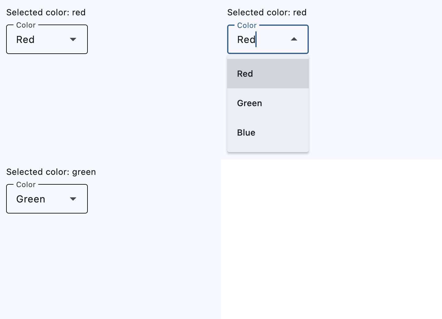
Select and change events
import flet as ft


def main(page: ft.Page):
    colors = [
        ft.Colors.RED,
        ft.Colors.BLUE,
        ft.Colors.YELLOW,
        ft.Colors.PURPLE,
        ft.Colors.LIME,
    ]

    def get_options() -> list[ft.DropdownOption]:
        options: list[ft.DropdownOption] = []
        for color in colors:
            options.append(
                ft.DropdownOption(
                    key=color.value,
                    content=ft.Text(value=color.value, color=color),
                    leading_icon=ft.Icon(ft.Icons.PALETTE, color=color),
                )
            )
        return options

    display_value = ft.Text()
    display_text = ft.Text()

    def dropdown_select(e: ft.Event[ft.Dropdown]):
        e.control.color = e.control.value
        display_value.value = f"VALUE changed to {e.control.value}"

    def dropdown_text_change(e: ft.Event[ft.Dropdown]):
        display_text.value = f"TEXT changed to {e.control.text}"

    page.scroll = ft.ScrollMode.AUTO
    page.add(
        ft.SafeArea(
            content=ft.Column(
                controls=[
                    display_value,
                    display_text,
                    ft.Dropdown(
                        key="select_change_dropdown",
                        editable=True,
                        label="Color",
                        width=float("inf"),
                        options=get_options(),
                        on_select=dropdown_select,
                        on_text_change=dropdown_text_change,
                    ),
                ],
            ),
        )
    )


if __name__ == "__main__":
    ft.run(main)
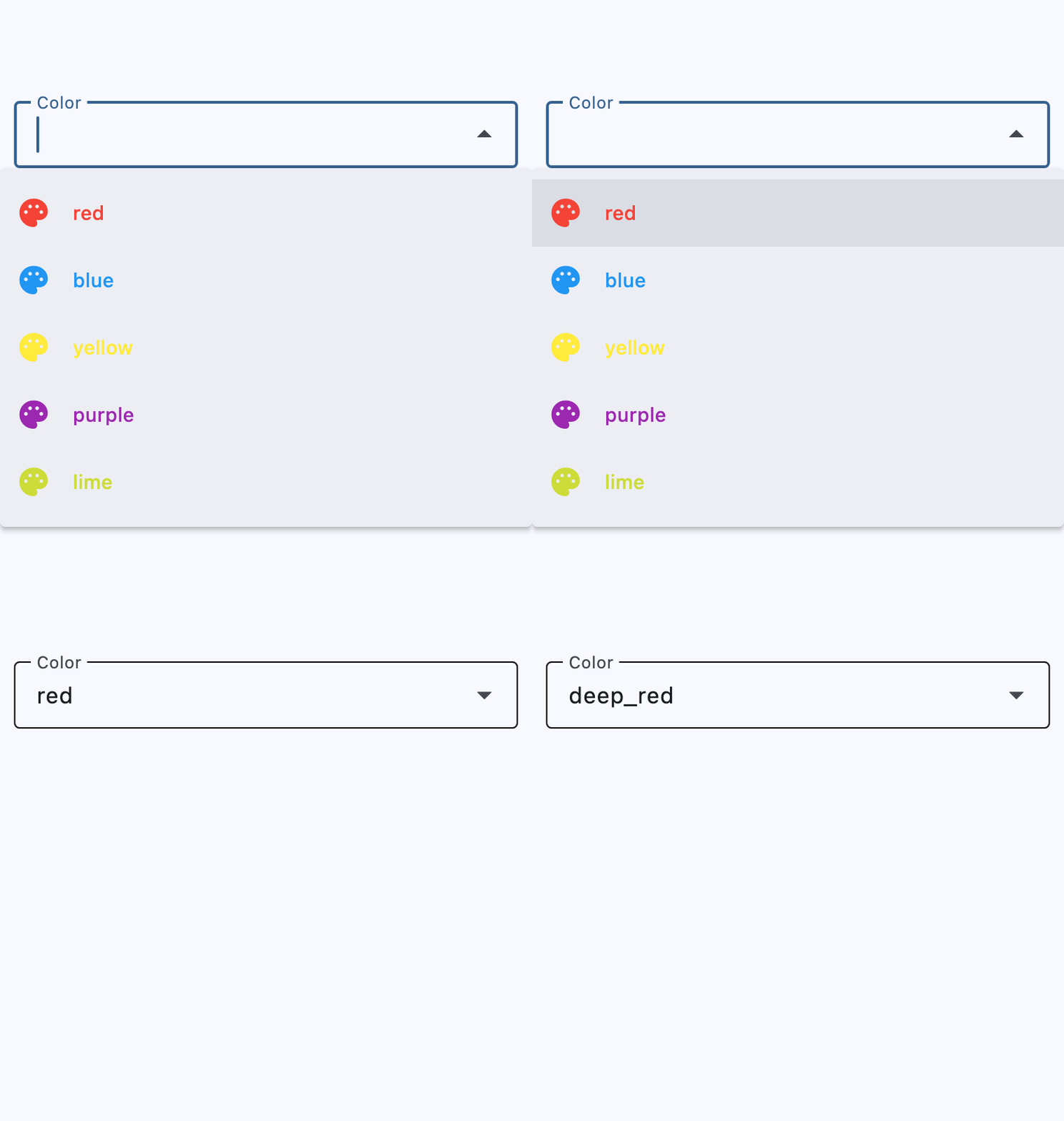
Styled
import flet as ft


def main(page: ft.Page):
    page.add(
        ft.SafeArea(
            content=ft.Column(
                controls=[
                    ft.Dropdown(
                        key="styled_dropdown_1",
                        text_size=20,
                        content_padding=10,
                        color=ft.Colors.PURPLE_200,
                        bgcolor=ft.Colors.BLUE_200,
                        filled=True,
                        border={
                            ft.ControlState.DEFAULT: ft.OutlineInputBorder(
                                border_radius=30,
                                side=ft.BorderSide(color=ft.Colors.GREEN_800),
                            ),
                            ft.ControlState.FOCUSED: ft.OutlineInputBorder(
                                border_radius=30,
                                side=ft.BorderSide(
                                    width=5, color=ft.Colors.GREEN_ACCENT_400
                                ),
                            ),
                        },
                        options=[
                            ft.DropdownOption("a", "Style 1A"),
                            ft.DropdownOption("b", "Style 1B"),
                            ft.DropdownOption("c", "Style 1C"),
                        ],
                    ),
                    ft.Dropdown(
                        key="styled_dropdown_2",
                        border={
                            ft.ControlState.DEFAULT: ft.OutlineInputBorder(
                                border_radius=30,
                                side=ft.BorderSide(color=ft.Colors.TRANSPARENT),
                            ),
                            ft.ControlState.FOCUSED: ft.OutlineInputBorder(
                                border_radius=30,
                                side=ft.BorderSide(width=20, color=ft.Colors.PINK_300),
                            ),
                        },
                        filled=True,
                        fill_color=ft.Colors.RED_400,
                        bgcolor=ft.Colors.RED_200,
                        color=ft.Colors.CYAN_400,
                        options=[
                            ft.DropdownOption("a", "Style 2A"),
                            ft.DropdownOption("b", "Style 2B"),
                            ft.DropdownOption("c", "Style 2C"),
                        ],
                    ),
                    ft.Dropdown(
                        key="styled_dropdown_3",
                        border={
                            ft.ControlState.DEFAULT: ft.OutlineInputBorder(
                                border_radius=30,
                                side=ft.BorderSide(
                                    width=5, color=ft.Colors.PINK_ACCENT
                                ),
                            ),
                            ft.ControlState.FOCUSED: ft.OutlineInputBorder(
                                border_radius=30,
                                side=ft.BorderSide(
                                    width=25, color=ft.Colors.GREEN_ACCENT_400
                                ),
                            ),
                        },
                        width=150,
                        options=[
                            ft.DropdownOption("a", "Style 3A"),
                            ft.DropdownOption("b", "Style 3B"),
                            ft.DropdownOption("c", "Style 3C"),
                        ],
                    ),
                    ft.Container(
                        padding=ft.Padding.only(bottom=20),
                        content=ft.Dropdown(
                            key="styled_dropdown_4",
                            text_size=30,
                            color=ft.Colors.ORANGE_ACCENT,
                            border={
                                ft.ControlState.DEFAULT: ft.OutlineInputBorder(
                                    border_radius=20,
                                    side=ft.BorderSide.none(),
                                ),
                                ft.ControlState.FOCUSED: ft.OutlineInputBorder(
                                    border_radius=20,
                                    side=ft.BorderSide(
                                        width=10, color=ft.Colors.GREEN_100
                                    ),
                                ),
                            },
                            filled=True,
                            autofocus=True,
                            width=200,
                            height=50,
                            options=[
                                ft.dropdown.Option("a", "Style 4A"),
                                ft.dropdown.Option("b", "Style 4B"),
                                ft.dropdown.Option("c", "Style 4C"),
                            ],
                        ),
                    ),
                    ft.Dropdown(
                        key="styled_dropdown_5",
                        text_size=30,
                        border={
                            ft.ControlState.DEFAULT: ft.OutlineInputBorder(
                                border_radius=20,
                                side=ft.BorderSide.none(),
                            ),
                            ft.ControlState.FOCUSED: ft.OutlineInputBorder(
                                border_radius=20,
                                side=ft.BorderSide(width=10, color=ft.Colors.GREEN_100),
                            ),
                        },
                        filled=True,
                        content_padding=20,
                        width=200,
                        options=[
                            ft.DropdownOption(
                                key="a",
                                text="Style 5A",
                                style=ft.ButtonStyle(
                                    shape=ft.BeveledRectangleBorder(radius=15),
                                    color={
                                        ft.ControlState.HOVERED: ft.Colors.WHITE,
                                        ft.ControlState.FOCUSED: ft.Colors.BLUE,
                                        ft.ControlState.DEFAULT: ft.Colors.BLACK,
                                    },
                                ),
                            ),
                            ft.DropdownOption(
                                key="b",
                                text="Style 5B",
                                style=ft.ButtonStyle(
                                    shape=ft.BeveledRectangleBorder(radius=15),
                                    color={
                                        ft.ControlState.HOVERED: ft.Colors.WHITE,
                                        ft.ControlState.FOCUSED: ft.Colors.BLUE,
                                        ft.ControlState.DEFAULT: ft.Colors.BLACK,
                                    },
                                ),
                            ),
                            ft.DropdownOption(
                                key="c",
                                text="Style 5C",
                                style=ft.ButtonStyle(
                                    shape=ft.BeveledRectangleBorder(radius=15),
                                    color={
                                        ft.ControlState.HOVERED: ft.Colors.WHITE,
                                        ft.ControlState.FOCUSED: ft.Colors.BLUE,
                                        ft.ControlState.DEFAULT: ft.Colors.BLACK,
                                    },
                                ),
                            ),
                        ],
                    ),
                ],
            ),
        )
    )


if __name__ == "__main__":
    ft.run(main)
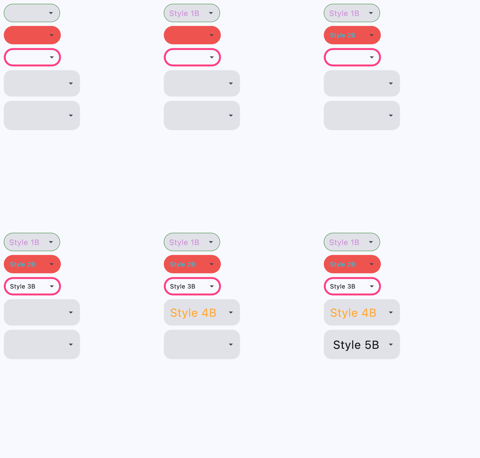
Properties
autofocusclass-attributeinstance-attribute
autofocus: bool = FalseWhether the control will be selected as the initial focus. If there is more than one control on a page with autofocus set, then the first one added to the page will get focus.
bgcolorclass-attributeinstance-attribute
bgcolor: ControlStateValue[ColorValue] | None = NoneThe background color of the dropdown menu in various ControlState
states.
borderclass-attributeinstance-attribute
border: ControlStateValue[InputBorder] | None = NoneThe border drawn around the decorated input area.
Accepts a single InputBorder or a dictionary mapping
ControlStates to InputBorders. Supported
state keys are ControlState.DEFAULT,
ControlState.FOCUSED, ControlState.ERROR,
and ControlState.DISABLED.
A single border defines the shape for all states. If its side is unset,
the Material theme resolves the border color and weight per state (for
example, the focused border uses the theme's primary color); an explicit
side applies to the enabled state while the other states remain
theme-resolved.
In the dictionary form, the DEFAULT entry behaves like the single form,
and each state entry without an explicit side falls back to the DEFAULT
entry's side, if set.
border_colorclass-attributedeprecatedinstance-attribute
border_color: ColorValue | None = NoneDeprecated since version 1.0.0 and scheduled for removal in 1.3.0. Use border with a BorderSide instead.
The border color.
border_radiusclass-attributedeprecatedinstance-attribute
border_radius: BorderRadiusValue | None = NoneDeprecated since version 1.0.0 and scheduled for removal in 1.3.0. Use border with an OutlineInputBorder instead.
Rounds the corners of an outlined border.
border_widthclass-attributedeprecatedinstance-attribute
border_width: Number | None = NoneDeprecated since version 1.0.0 and scheduled for removal in 1.3.0. Use border with a BorderSide instead.
The width of the border in virtual pixels.
capitalizationclass-attributeinstance-attribute
capitalization: TextCapitalization | None = NoneConfigures how the text input should be capitalized.
content_paddingclass-attributeinstance-attribute
content_padding: PaddingValue | None = NoneThe padding for the input decoration's container.
denseclass-attributeinstance-attribute
dense: bool = FalseWhether the TextField is part of a dense form (i.e., uses less vertical space).
editableclass-attributeinstance-attribute
editable: bool = FalseWhether the dropdown allows editing of the text input field.
elevationclass-attributeinstance-attribute
elevation: ControlStateValue[Number | None] | None = 8The dropdown's menu elevation in various ControlState
states.
enable_filterclass-attributeinstance-attribute
enable_filter: bool = FalseDetermine if the menu list can be filtered by the text input. Defaults to false.
If set to true, dropdown menu will show a filtered list. The filtered list will contain items that match the text provided by the input field, with a case-insensitive comparison.
enable_searchclass-attributeinstance-attribute
enable_search: bool = TrueDetermine if the first item that matches the text input can be highlighted.
error_styleclass-attributeinstance-attribute
error_style: TextStyle | None = NoneThe TextStyle to use for error_text.
error_textclass-attributeinstance-attribute
error_text: str | None = NoneText that appears below the input border.
If non-null, the border's color animates to red and the helper_text is
not shown.
expanded_insetsclass-attributeinstance-attribute
expanded_insets: PaddingValue | None = NoneThe insets for the expanded dropdown menu.
fill_colorclass-attributeinstance-attribute
fill_color: ColorValue | None = NoneBackground color of the dropdown input text field.
Will not be visible if filled=False.
filledclass-attributeinstance-attribute
filled: bool = FalseWhether the decoration's container is filled with theme fill_color.
focused_border_colorclass-attributedeprecatedinstance-attribute
focused_border_color: ColorValue | None = NoneDeprecated since version 1.0.0 and scheduled for removal in 1.3.0. Use border with a ControlState.FOCUSED entry instead.
Border color in focused state.
focused_border_widthclass-attributedeprecatedinstance-attribute
focused_border_width: Number | None = NoneDeprecated since version 1.0.0 and scheduled for removal in 1.3.0. Use border with a ControlState.FOCUSED entry instead.
Border width in focused state.
helper_styleclass-attributeinstance-attribute
helper_style: TextStyle | None = NoneThe TextStyle to use for helper_text.
helper_textclass-attributeinstance-attribute
helper_text: str | None = NoneText that provides context about the input's value, such as how the value will be used.
If non-null, the text is displayed below the input decorator, in the same location
as error_text. If a non-null error_text value is specified then the helper text
is not shown.
hint_textclass-attributeinstance-attribute
hint_text: str | None = NoneText that suggests what sort of input the field accepts.
Displayed on top of the input when it's empty and either (a) label is null or (b)
the input has the focus.
hover_colorclass-attributeinstance-attribute
hover_color: ColorValue | None = NoneThe color of the dropdown input text field when hovered.
input_filterclass-attributeinstance-attribute
input_filter: InputFilter | None = NoneA filter to apply to the text input field.
labelclass-attributeinstance-attribute
label: StrOrControl | None = NoneOptional text that describes the input field.
When the input field is empty and unfocused, the label is displayed on top of the input field (i.e., at the same location on the screen where text may be entered in the input field). When the input field receives focus (or if the field is non-empty) the label moves above, either vertically adjacent to, or to the center of the input field.
label_styleclass-attributeinstance-attribute
label_style: TextStyle | None = NoneThe label's text style.
leading_iconclass-attributeinstance-attribute
leading_icon: IconDataOrControl | None = NoneAn optional Icon at the front of the text input field inside the decoration box.
If this is not null, the menu items will have extra paddings to be aligned with the text in the text field.
menu_heightclass-attributeinstance-attribute
menu_height: Number | None = NoneThe height of the dropdown menu.
If this is None, the menu will display as many
items as possible on the screen.
menu_styleclass-attributeinstance-attribute
menu_style: MenuStyle | None = NoneThe menu style that defines the visual attributes of the menu.
The default width of the menu is set to the width of the text field.
menu_widthclass-attributeinstance-attribute
menu_width: Number | None = NoneThe width of the dropdown menu.
If this is None, the menu width will be the same as
input textfield width.
optionsclass-attributeinstance-attribute
options: list[DropdownOption] = field(default_factory=list)A list of options to display in the dropdown.
selected_suffixclass-attributeinstance-attribute
selected_suffix: Control | None = NoneA control to display after the selected item in the dropdown.
selected_trailing_iconclass-attributeinstance-attribute
selected_trailing_icon: IconDataOrControl | None = NoneAn optional icon at the end of the text field to indicate that the text field is pressed.
text_alignclass-attributeinstance-attribute
text_align: TextAlign = TextAlign.STARTThe text align for the TextField of the Dropdown.
text_sizeclass-attributeinstance-attribute
text_size: Number | None = NoneText size in virtual pixels.
text_styleclass-attributeinstance-attribute
text_style: TextStyle | None = NoneThe TextStyle to use for text in input text field.
trailing_iconclass-attributeinstance-attribute
trailing_icon: IconDataOrControl | None = NoneAn icon to display at the end of the text field.
valueclass-attributeinstance-attribute
value: str | None = NoneThe DropdownOption.key of the dropdown options
corresponding to the selected option.
Events
on_blurclass-attributeinstance-attribute
on_blur: ControlEventHandler[Dropdown] | None = NoneCalled when the control has lost focus.
on_focusclass-attributeinstance-attribute
on_focus: ControlEventHandler[Dropdown] | None = NoneCalled when the control has received focus.
on_selectclass-attributeinstance-attribute
on_select: ControlEventHandler[Dropdown] | None = NoneCalled when the selected item of this dropdown has changed.
on_text_changeclass-attributeinstance-attribute
on_text_change: ControlEventHandler[Dropdown] | None = NoneCalled when the text input of this dropdown has changed.